In this project, I will explore using Machine Learning to forecast future stock prices. By leveraging AWS SageMaker Canvas, I’ll build a stock prediction model using time series forecasting and then visualize the results with AWS QuickSight.
Step1 : Create SageMaker Domain
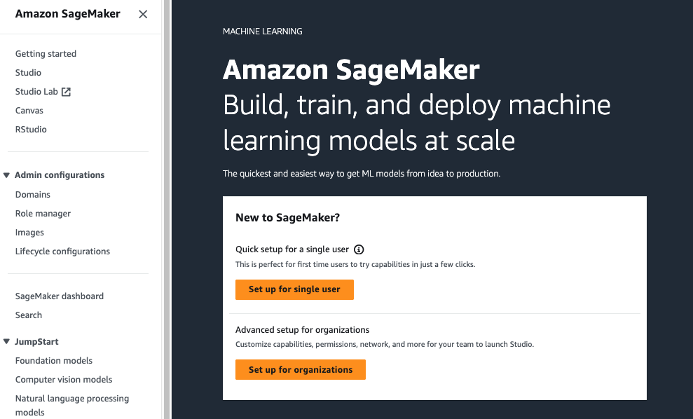
To kick off the project, navigate to the SageMaker console and click on Setup up for single users. This process grants access to SageMaker Canvas by automatically creating a domain and user profile. The domain is essential as it provides a centralized location for storing data models and other resources necessary for this project.
Step 2: Obtain Historical Data
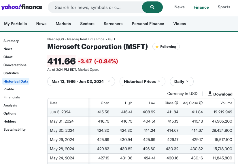
To gather the historical stock data, you can use several sources such as Nasdaq and Yahoo Finance. While Nasdaq provides data for up to the past 10 years, Yahoo Finance offers a more extensive range, with records dating back to 1986. Therefore, I’ll utilize Yahoo Finance to obtain the comprehensive historical data needed for this project.
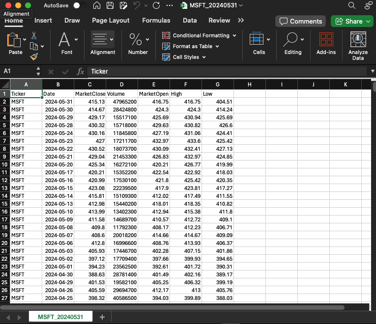
After downloading the historical data as a CSV file, I’ll make several modifications and save the file as MSFT_20240531.csv:
- Add a new column Ticker and set its value to MSFT
- Delete column Close
- Rename columns Adj Close to MarketClose, Open to MarketOpen
- Format columns MarketOpen, MarketClose, High, and Low to numbers with 2 decimals
Step 3: Upload Dataset to S3 Bucket
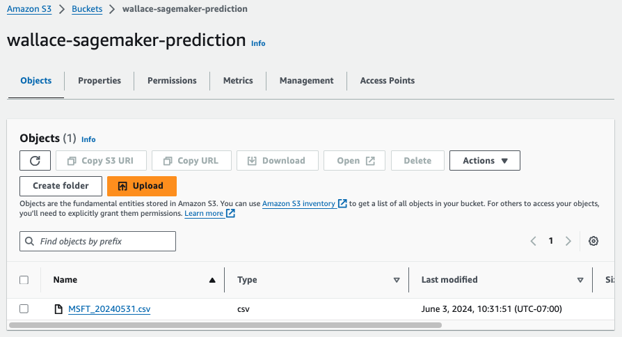
SageMaker accepts data stored in S3 so I create a S3 bucket and upload my MSFT_20240531.csv.
Step 4: Build SageMaker Canvas Model
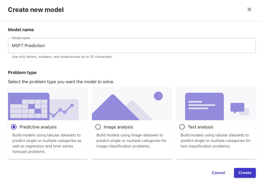
To build the machine learning model, go to SageMaker and select the default domain created in Step 1. Launch Canvas, click on My Models and New model button to start creating the model.
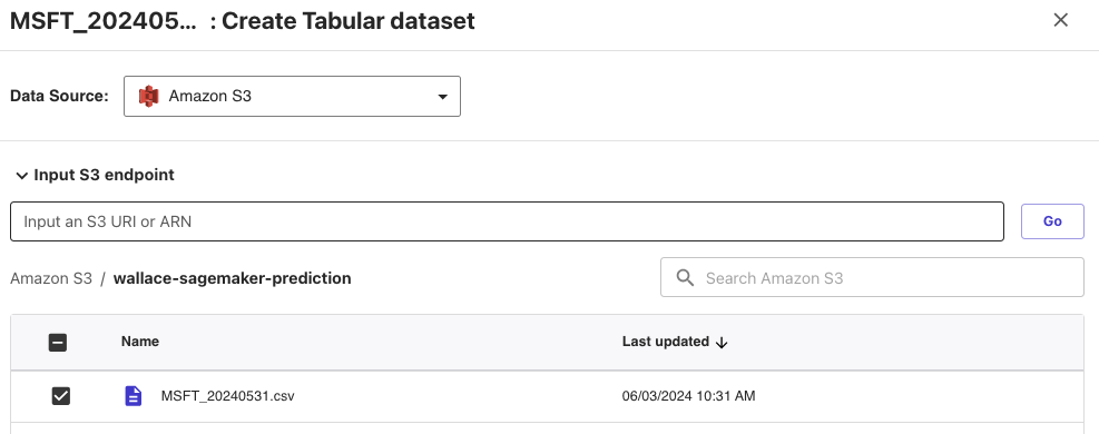
Create a new dataset and select Amazon S3 as the data source, then choose the S3 bucket and select the CSV file uploaded earlier.
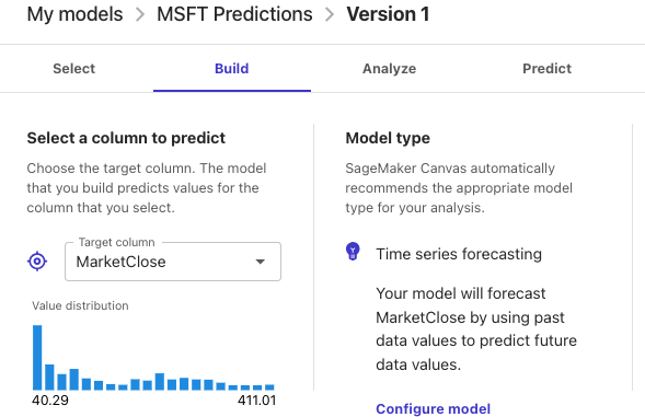
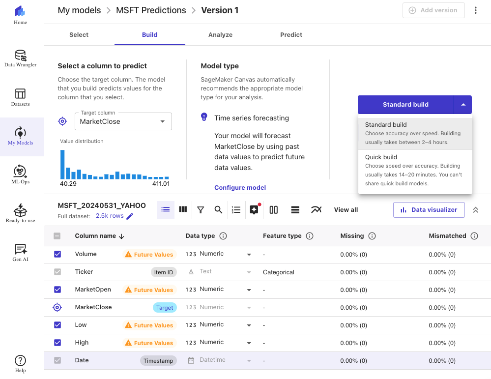
Navigate to Build section, select MarketClose as the Target column. This will be the column the model predicts for future value.
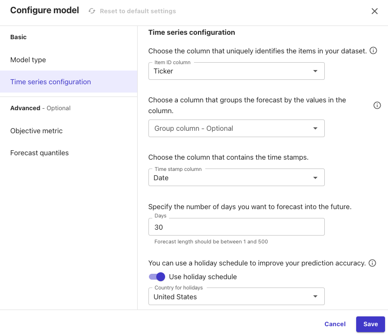
Select all columns to be included in the model and click Configure model with the following parameters:
- Model type: Time series forecasting
- Time series configuration:
- Item ID column: Ticker
- Time stamp column: Date
- Specify the number of days to forecast: 30
- Use holiday schedule: United States
Now it’s time to train our model. SageMaker Canvas offers two training options
- Quick build: Allows faster prototyping that produces a trained model in less than 20 minutes.
- Standard build: Provides a more accurate trained model but takes longer time.
For this project, I’ll choose the Standard build option, which is estimated to complete in about 2 hours. It’s important to keep the session active without logging out; otherwise, the model building will stop.
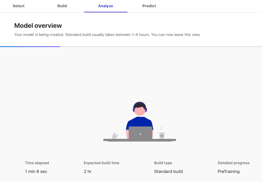
Step 5: Analyze and Generate Prediction
During the forecast process, Canvas splits the data into two sets: a training set and testing set. The training set is utilized to train the model, while forecasts are generated within the testing set. Accuracy is evaluated by comparing these forecasts with the actual values in the testing set.
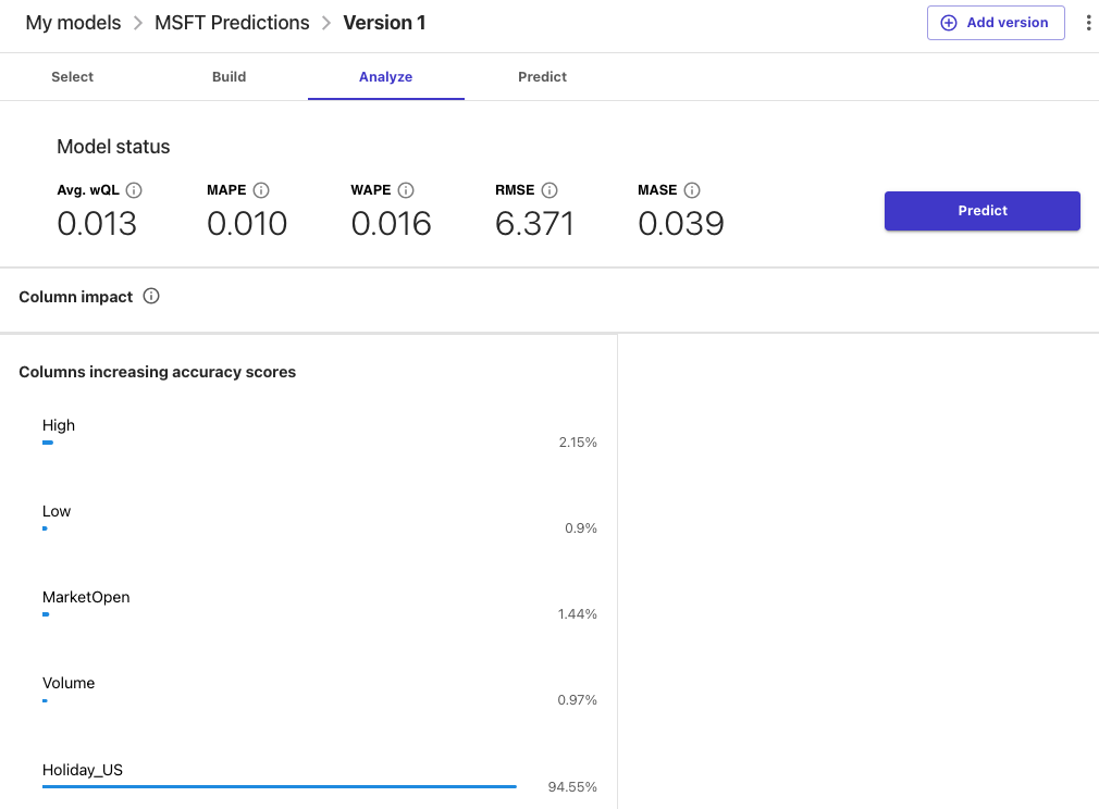
After the build is completed, the analysis section displays various metrics to assess the accuracy of the forecast. Lower values indicate a more accurate model. One such metric is MAPE (mean absolute percent error), which measures the percentage difference between the mean forecasted value and the actual means. A MAPE value of 0 indicates a model with no error, so our model appears to perform quite well.
For a detailed explanation of these metrics, refer to this resource.
Now that the model is trained, let’s use it to create a prediction for future Microsoft stock prices. Click on Predict, choose Single item for prediction type and select MSFT in item:
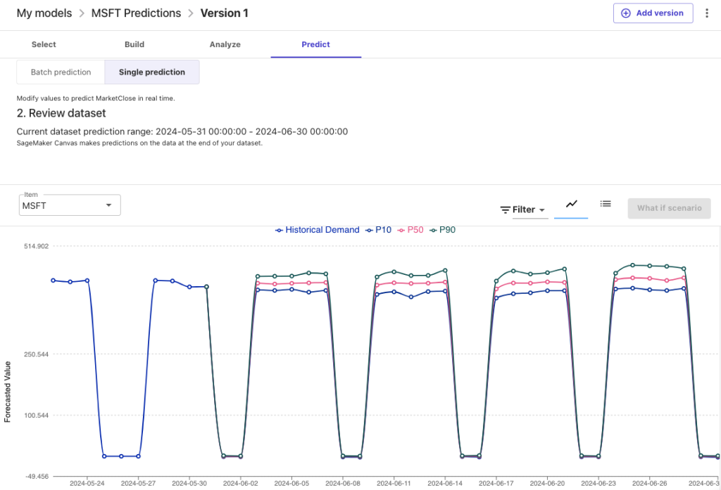
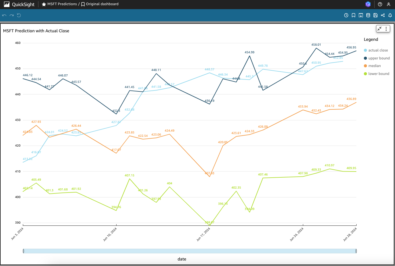
Canvas computes the forecast values at three different quantiles (P10, P50, P90):
- P10 – The true value is expected to be lower than the forecasted value 10% of the time.
- P50 – The true value is expected to be lower than the forecasted value 50% of the time.
- P90 – The true value is expected to be lower than the forecasted value 90% of the time.
In the context of buying low and selling high in the stock market, P10 would serves as an entry point to buy; while P90 would indicate a suitable point to sell.
Let’s download the prediction in CSV format for use in the next step. Don’t forget to log out from Canvas to avoid ongoing charges.
Step 6: Visualize Prediction with QuickSight
To visualize the prediction made by SageMaker Canvas, follow these steps:
- Open QuickSight console and click on New dataset
- Select “Upload a file” and choose the CSV file downloaded from SageMaker Canvas
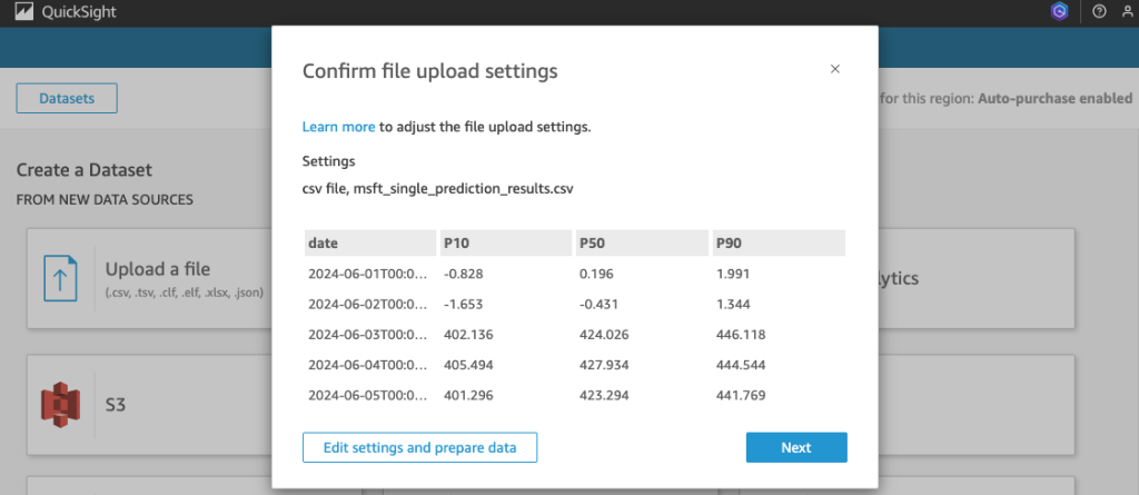
After uploading the file, rename the following data fields:
- P10 to lower bound
- P50 to median
- P90 to upper bound
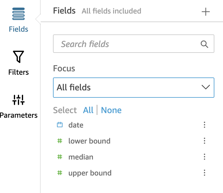
Click on Analyses and select “New analysis” using the newly created dataset, configure the visualization using “Line Chart” as the type. Place date on the x-axis and fields lower bound, media, and upper bound on the y-axis as values.
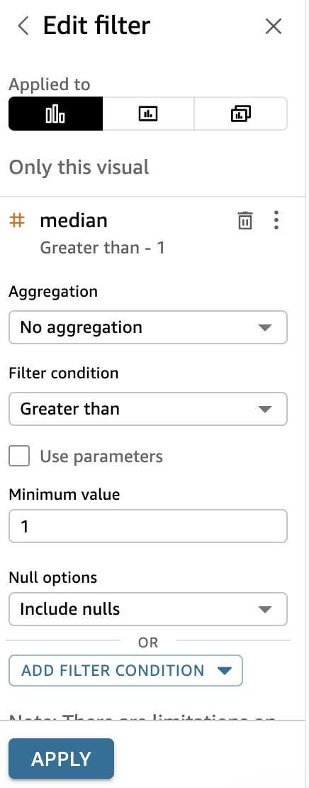
To exclude holidays, create a filter where median is greater than 1:
After applying the filter, our chart looks like below:
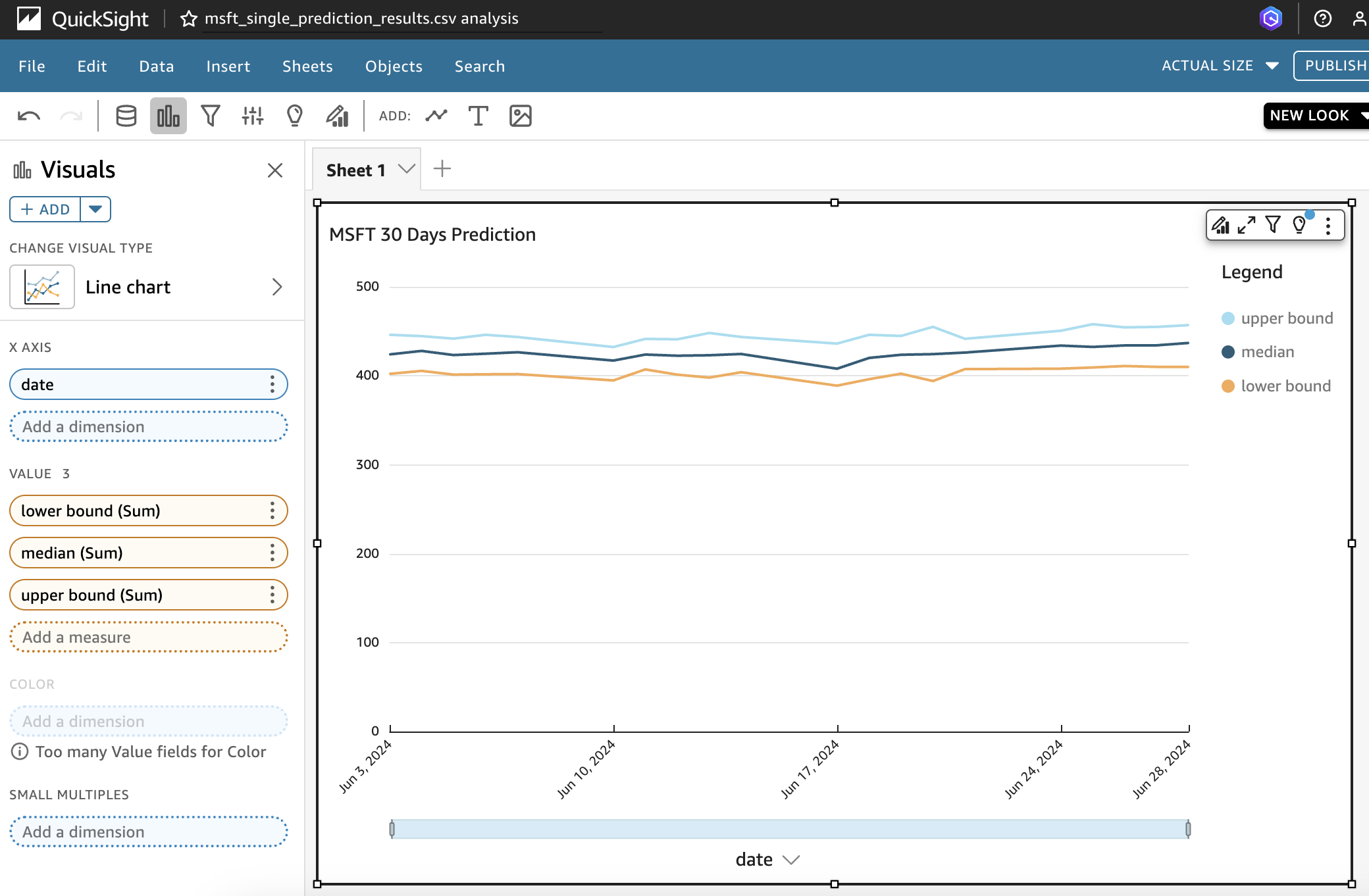
Finally, click on “Save and Publish” to make the chart available on the Dashboard.
(Updated 2 July 2024: I added actual market close price of MSFT to the chart so you can see the performance of Sagemaker ML prediction)
Please note that this post is for educational purposes only and should not be used for making investment decisions. Always conduct thorough research and consult with a financial advisor before making any investment decisions. Thank you for reading my blog post.


